For the second consecutive year, Erreà Sport is back with the “City ID” personalization project with which it explores new communication languages for its own volleyball teams.
Unlike last year, in which the works focused on lettering, the main focus of this year’s collection is to put the most important monuments or symbols of the city represented, which in this case, is Milan, at the center of everything.
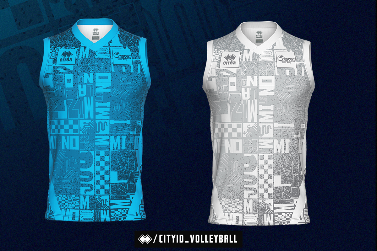
The uniforms made for the pre-season of the Powervolley Milano consist of two tank tops, which despite having the same graphics have different colors: one in blue, and one white designed for libero.
The heraldic symbol of the snake, two bichromatic chessboards placed on the left wall just inside Sant’Ambrogio, and the decomposed writing “Milan” and “22 -23”, create an unprecedented square pattern that is repeated in tone.
With a semi-adherent fit, the fabric used is the Mundial, soft and comfortable, with a double-perforated construction, characterized by the presence of tiny micro-holes designed to ensure ventilation and optimal body temperature regulation. The breathability completes the characteristics of this yarn with a “second skin” effect, ideal for supporting competition performances.
Like all Erreà garments, this collection is also Oeko-Tex Standard 100 certified, the certificate that since 2007 has set extremely strict limits on substances harmful to health, guaranteeing a high level of quality and safety.


